Exploration and Visualization of the 2023 World Population Dataset
Visualization and Data Exploration using Python

I’m a Software Engineer with over 5+ years of experience in Technology with a track record in building web applications, mobile applications and Technical Writing. Readily available to explore innovations in ICT and creatively use them to build solutions. Advancing my career in software engineering and contributing to the growth of tech communities around the world. I’m also passionate about working with organizations especially tech, security experts and airline industries to learn and also make contributions that will be a legacy.
Tech is Easy to Learn - https://amazon.com/dp/B0B8T838K
In this article, we'll explore and visualize the 2023 world population as part of the requirement for AI Saturdays Lagos Cohort 8 assignment on Data Visualization and Exploration lecture and lab
About the Dataset
The dataset World Population by Country 2023 containing information about Countries in the world by population 2023 is available on Kaggle.
This list includes both countries and dependent territories. Data based on the latest United Nations Population Division estimates.
Country - Name of countries and dependent territories.
Population2023 - Population in the year 2023
YearlyChange - Percentage Yearly Change in Population
NetChange - Net Change in Population
Density(P/Km²)- Population density (population per square km)
Land Area(Km²) - Land area of countries / dependent territories.
Migrants(net) - Total number of migrants
Fert.Rate - Fertility rate
Med.Age - Median age of the population
UrbanPop%- Percentage of urban population
WorldShare - Population share
The visualization and data exploration will be done using this dataset.
Economic growth and development are affected by population positively or negatively hence the need to understand the essence of using this dataset of the world population by country as an example.
Tools
The following are the tools and libraries used in this data exploration analysis and visualization.
For this article, I'll be using Google Colab but any Integrated development environment or code editor can be used such as Pycharm, Anaconda, and Vscode.
Data Exploration
- Dataset overview
Here's the outlook of Colab environment
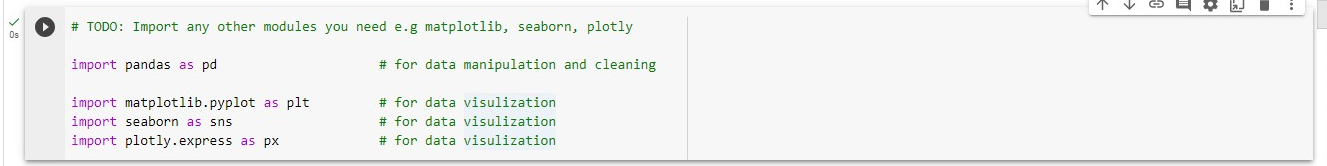
Let's start by importing the modules needed for the data exploration
import pandas as pd                   # for data manipulation and cleaning

import matplotlib.pyplot as plt         # for data visulization
import seaborn as sns                   # for data visulization
import plotly.express as px             # for data visulization
Click the play button by the left top to execute the block of code. If it shows the tick sign it means the libraries have been imported and are ready for use.
Every bit of code to be executed should be done in a new code block.
I added the downloaded Kaggle dataset of the world population of 2023 to the Google Drive folder. This could be any location depending on your choice of tools.
Next, import the drive from colab, and read the file using the pandas module.
# TODO: Read WorldPopulation2023.csv dataset into a well named dataframe

from google.colab import drive
drive.mount('/content/drive')

df = pd.read_csv('drive/MyDrive/WorldPopulation2023.csv')
After clicking on the execute button it'll request to connect and grant access permission to the Google Drive folder.
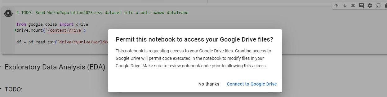
if successfully mounted it'll show this message Mounted at /content/drive
Next, let's show the first 5 records using the head() method in pandas module.
df.head()

#df.head(10) for the first 10 records
#df.tail() for the last records on the file
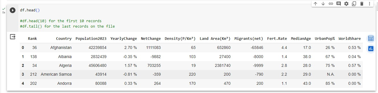
From the display of the sample records it is important to do data cleaning to ensure smooth visualization.
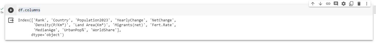
- To view the columns in the dataframe
df.columns
To view the size of the dataset
df.size

- To view the shape of the dataset
#Check the shape of the data
df.shape

- To view more features of the dataset
df.info(verbose = False)

- To view the data types
# Data types for each column in dataframe
df.dtypes
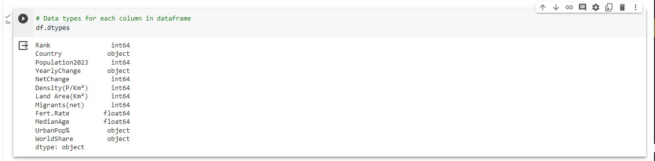
By observing the information from the df.head() you'll notice that there is % sign attached to some values, N.A. value in a column, and values with float number represented as int or object in the datatype.
Exploratory Data Analysis (EDA)
The following steps are taken during exploratory data analysis to understand the dataset properly.
- To describe the dataset
# Dataframe description
df.describe()
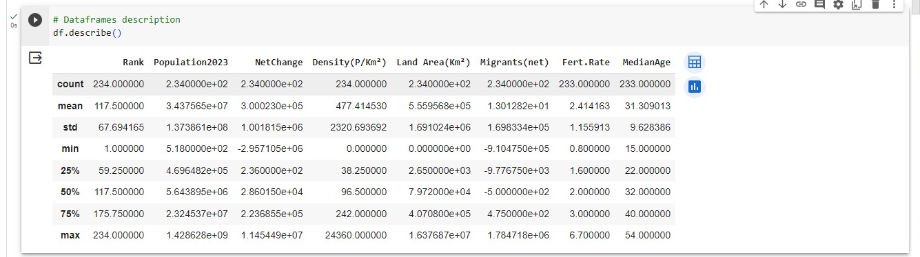
This contains the count, mean, standard deviation, minimum and maximum number, and percentage classification.
You can use the two icons on the top right to display more information even with visualization.
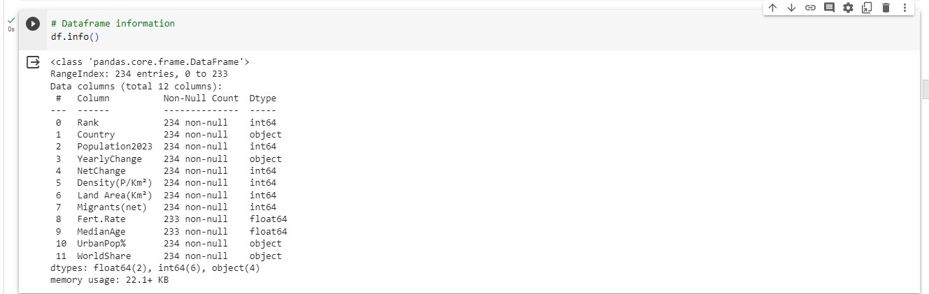
- To show the info
# Dataframe information
df.info()
Data Preprocessing and Cleaning
Data preprocessing and cleaning is the stage of reviewing the accuracy of the data, cleaning up unwanted values and modifying column data types to ensure proper data exploration and visualization.
- To check for columns with null values
print("Number of missing values")
df.isnull().sum()
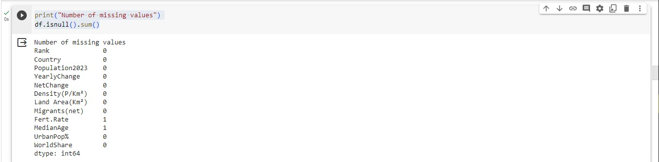
From the image above, It means that Fert.Rate and MedianAge have missing values.
- To check if there are duplicate records
# Check for duplicates
duplicates = df.duplicated()
duplicates.sum()
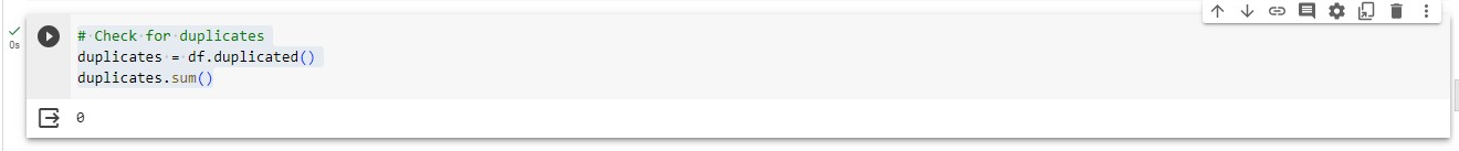
There are no duplicate records.
Duplicate records can be removed|dropped using the code below during data cleaning.
# Drop duplicates from apps_with_duplicates
apps = df.drop_duplicates()
- To keep a copy of the original dataset use the code below
# save a copy of the data
df_data_copy = df.copy()
To have a clean code we'll define a wrangle_data function for the preprocessing and cleaning of data.
The wrangle_data function does the following
checks for % across the detected column and replaces it
remove the N.A. value in the UrbanPop% column
change the datatype of columns according to the values.
replace empty values with 0.0
def wrange_data(data):

  #replace the % with an empty space to allow for easy calculation
  data['YearlyChange'] = data['YearlyChange'].str.replace('[%]', '', regex=True)
  data['WorldShare'] = data['WorldShare'].str.replace('[%]', '', regex=True)
  data['UrbanPop%'] = data['UrbanPop%'].str.replace('[%]', '', regex=True)

  #find and replace the N.A. string
  data['UrbanPop%'] = data['UrbanPop%'].str.replace('N.A.', '0', regex=True)

  # Convert YearlyChange to float data type from character
  data['YearlyChange'] = data['YearlyChange'].astype(float)

  # Convert UrbanPop% to integer data type from character
  data['UrbanPop%'] = data['UrbanPop%'].astype(int)

  # Convert WorldShare  to float data type from character
  data['WorldShare'] = data['WorldShare'].astype(float)

#clean NaN values from the data
# names of the columns
  columns = data.columns

# looping through the columns to fill the entries with NaN values with ""
  for column in columns:
      data[column] = data[column].fillna(0.0)

  return data
Next, execute the wrangle data function by passing the dataframe as a parameter and using the pandas head method to show the cleaned data.
#execute function block
df_data = wrange_data(df)

df_data.head()
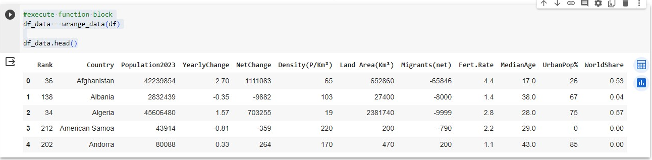
You can see that the N.A., % value and datatype have been taken care of...
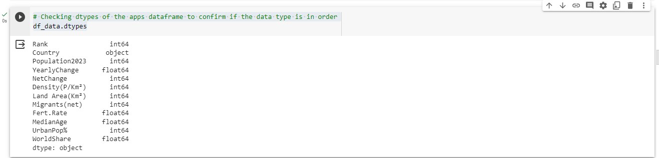
# Checking dtypes of the apps dataframe to confirm if the data type is in order
df_data.dtypes
Data Visualization
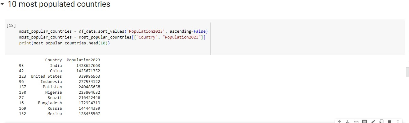
Top 10 Most Populated Countries
most_popular_countries = df_data.sort_values('Population2023', ascending=False)
most_popular_countries = most_popular_countries[["Country", "Population2023"]]
print(most_popular_countries.head(10))
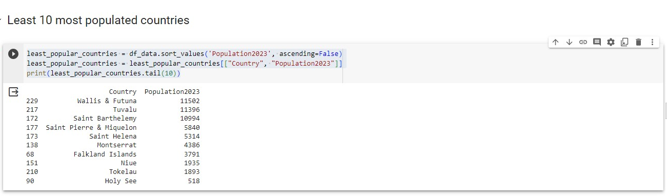
Least 10 Populated Countries
least_popular_countries = df_data.sort_values('Population2023', ascending=False)
least_popular_countries = least_popular_countries[["Country", "Population2023"]]
print(least_popular_countries.tail(10))
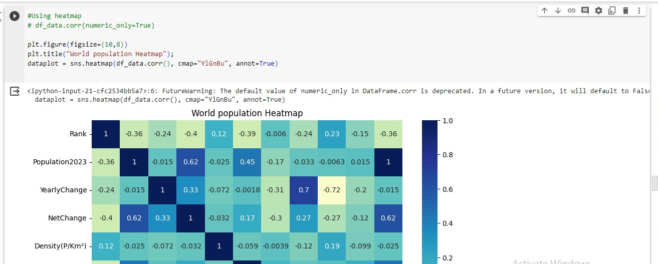
Correlation Analysis
Using heatmap to visualize the correlation between the numeric features in the dataset
#Using heatmap
# df_data.corr(numeric_only=True)

plt.figure(figsize=(10,8))
plt.title("World population Heatmap");
dataplot = sns.heatmap(df_data.corr(), cmap="YlGnBu", annot=True)
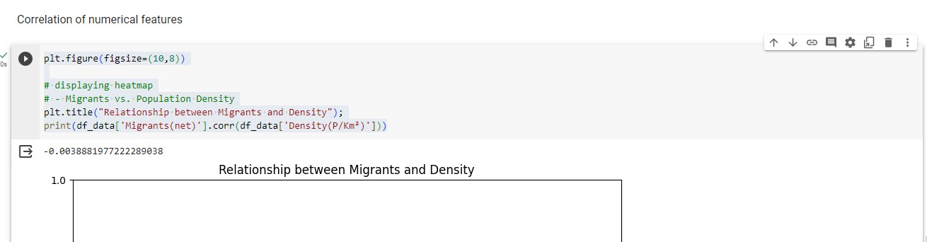
Relationships Between Features
- Migrants vs. Population Density
plt.figure(figsize=(10,8))

# displaying heatmap
# - Migrants vs. Population Density
plt.title("Relationship between Migrants and Density");
print(df_data['Migrants(net)'].corr(df_data['Density(P/Km²)']))
- Relationship between MedianAge and Yearly Change
#Relationship between MedianAge and Yearly Change
print(df_data['MedianAge'].corr(df_data['YearlyChange']))

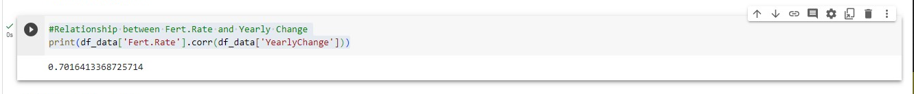
- Relationship between Fert.Rate and Yearly Change
#Relationship between Fert.Rate and Yearly Change
print(df_data['Fert.Rate'].corr(df_data['YearlyChange']))
Additional Insights
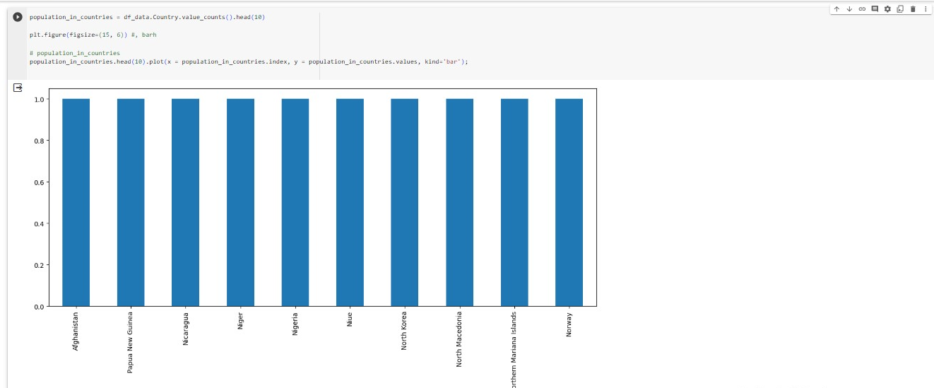
- Bar chart representation of 10 countries and their counts
population_in_countries = df_data.Country.value_counts().head(10)
plt.figure(figsize=(15, 6)) #, barh

# population_in_countries
population_in_countries.head(10).plot(x = population_in_countries.index, y = population_in_countries.values, kind='bar');
- Using seaborn to display the data
#using seaborn
fig, ax = plt.subplots()
fig.set_size_inches(15, 6)

ax = sns.barplot(x = population_in_countries.index, y = population_in_countries.values)
ax.set_xticklabels(ax.get_xticklabels(), rotation=90);
Seaborn is more visually presentable than plotly

Conclusion
In this article, we have covered data exploration and visualization using the world population 2023 dataset from Kaggle. Data can be analyzed and visualized using Python, the modules and other tools. Storytelling on data can be done using Python.
The learning experience and the article development have been amazing and will be a continuous process.
Article Resources
How to unmount drive in Google Colab and remount to another drive?
Cohort 8 Labs: Week 5 -- Visualization and Data Exploration by Oluwaseun Ajayi
How to visualize the best story telling Practices with Python
Acknowledgments
AI Saturdays Lagos Cohort 8 organization team has made my artificial intelligence an awesome experience. Great tutoring sessions in the Data Visualization and Exploration class | lab by Aseda Addai-Deseh and Oluwaseun Ajayi.
My motivation for this assignment is how much impact Data science has in aiding decision-making and visualization of datasets and due to my passion for Artificial Intelligence, Machine learning and Data science.
X: Alemsbaja | Youtube: Tech with Alemsbaja to stay updated on more articles
Find this helpful or resourceful?? kindly share and feel free to use the comment section for questions, answers, and contributions.


